
AAVRANI is a beauty brand focused on plant-based skincare products. The goal of this project was to design a digital experience that reflects the brand’s identity while making it easy for customers to explore products and understand their benefits.
Focus Area
The design focuses on creating clear product presentation, strong visual hierarchy, and a smooth browsing experience across devices.
Roles
UI UX Designer
Platform
Responsive Web Design (Desktop, Tablet, Mobile)
Tools
Figma
Photoshop
Illustrator
Skincare products often contain detailed information such as ingredients, benefits, routines, and clinical claims. Presenting all of this clearly while keeping the browsing experience simple was a key challenge.
Users often struggled with:
• Understanding product benefits quickly
• Navigating multiple product categories and routines
• Comparing products with many details and attributes
Without a clear structure, product information can easily become overwhelming and slow down purchase decisions.

The design focused on simplifying product discovery while clearly communicating the brand’s value.
• Introduced clear product hierarchy to help users quickly scan product information
• Simplified category navigation to make product exploration easier
• Structured product cards and pages to highlight the most important details first
• Used icons and visual cues to communicate product benefits quickly
• Established a consistent visual system to maintain clarity across the website

How I Started
Research & Benchmarking
Structuring the Experience
Wireframing Key Flows
These wireframes helped validate that the experience felt intuitive, coherent, and conversion-focused long before any UI styling was applied.
Moving Into High-Fidelity Design


The brand needed to communicate science, tradition, and clean ingredients quickly so users could understand the brand value within seconds.
I simplified the brand message into three short, scannable content blocks supported by icons.
This allowed users to quickly understand the key ideas visually without relying on long paragraphs.

Products can be explored by rituals, concerns, and categories, which can easily confuse users and make product discovery slower.
I grouped the navigation into a compact horizontal tab system with a limited number of clearly labeled categories.
This helped users explore product groups more easily and find relevant products faster without feeling overwhelmed.
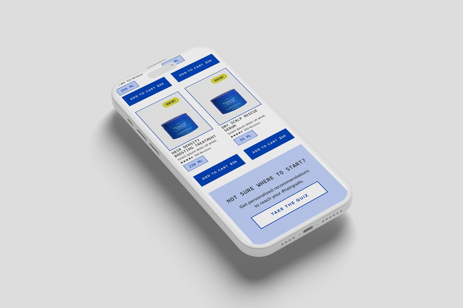
Each product contains multiple details such as price, size, reviews, clinical claims, and “New” tags, which can make product cards difficult to scan quickly.
Solution:
I structured the product cards so the product image and name dominate the visual focus, while secondary information follows in a clear and predictable order. The Add to Cart button was placed in a consistent position across all cards.
This helped users quickly scan products, compare options more easily, and move toward purchase with less friction.
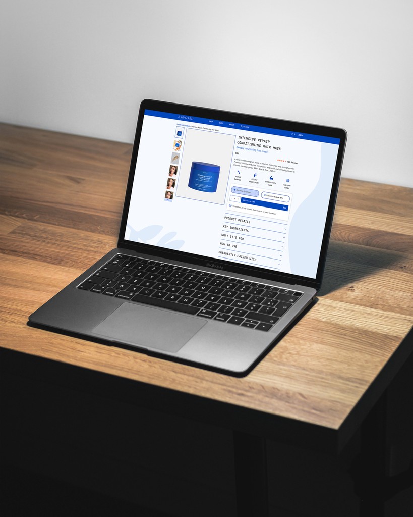
PDPs needed to present benefits, ingredients, claims, FAQs, and clinical results without overwhelming users.
Solution:
I showed the most important information first and revealed additional details step by step. The page begins with a short benefit overview, followed by icon highlights and expandable sections for deeper information.
This allowed users to understand key product information quickly while accessing deeper details only when needed.

Integrating social proof without disrupting the page layout.
I placed social proof sections within clear card blocks and used enough whitespace around them so they stand out without breaking the flow of the page.
This helped users notice reviews and testimonials easily while keeping the overall layout clean and balanced.

Creating a modular and scalable design system that can support future growth.
I designed a modular system using familiar card patterns, consistent spacing, clear typography, and reusable section templates.
This makes new pages easier to create while keeping the interface consistent across the website.
Appreciate you taking the time to explore this project. I hope it offered useful insight into my UX process and how I design for clarity, scale, and real user needs.