AAVRANI

AAVRANI

A Premium Skincare Experience Rooted in Culture and Clarity

A Premium Skincare Experience Rooted in Culture and Clarity

A Premium Skincare Experience Rooted in Culture and Clarity

Roles

Roles

Roles

UI UX Designer

UI UX Designer

UI UX Designer

Deliverables

Deliverables

Deliverables

Research & Strategy:

Research & Strategy:

  • Information architecture

UI/UX Design:

UI/UX Design:

  • User Flows

  • High-fidelity mockups and prototypes

  • Design system and UI kit

  • User Flows

  • High-fidelity mockups and prototypes

  • Design system and UI kit

  • User Flows

  • High-fidelity mockups and prototypes

  • Design system and UI kit

Tools

Tools

Tools

  • Figma

  • Slack

  • Photoshop

  • Illustrator

Overview

AAVRANI is a luxury skincare brand inspired by ancient Indian beauty rituals. Its mission is to bring the wisdom of natural ingredients into modern self-care routines.

AAVRANI is a luxury skincare brand inspired by ancient Indian beauty rituals. Its mission is to bring the wisdom of natural ingredients into modern self-care routines.

AAVRANI is a luxury skincare brand inspired by ancient Indian beauty rituals. Its mission is to bring the wisdom of natural ingredients into modern self-care routines.

As part of the design team, I contributed to crafting a digital experience that balances heritage and modernity, creating a website that feels both luxurious and effortless.

As part of the design team, I contributed to crafting a digital experience that balances heritage and modernity, creating a website that feels both luxurious and effortless.

As part of the design team, I contributed to crafting a digital experience that balances heritage and modernity, creating a website that feels both luxurious and effortless.

Goal

Balancing Luxury with Clarity

My goal was to build a digital experience that reflects AAVRANI's authenticity while ensuring clarity and usability. The website needed to look premium, tell stories gracefully, and make it easy for users to explore and purchase products.

My goal was to build a digital experience that reflects AAVRANI's authenticity while ensuring clarity and usability. The website needed to look premium, tell stories gracefully, and make it easy for users to explore and purchase products.

My goal was to build a digital experience that reflects AAVRANI's authenticity while ensuring clarity and usability. The website needed to look premium, tell stories gracefully, and make it easy for users to explore and purchase products.

Design Opportunities Identified

Establishing Visual Hierarchy

Establishing Visual Hierarchy

The goal was to create a visual rhythm that feels luxurious yet intuitive. Since this was a fresh build, I focused on defining how imagery, typography, and whitespace could balance storytelling with usability ensuring every section had a clear focal point.

The goal was to create a visual rhythm that feels luxurious yet intuitive. Since this was a fresh build, I focused on defining how imagery, typography, and whitespace could balance storytelling with usability ensuring every section had a clear focal point.

Structuring Intuitive Navigation

Structuring Intuitive Navigation

From the beginning, it was important to help users explore products either by ritual, ingredient, or concern. I designed a navigation structure that allows multiple entry points into the brand story while keeping the overall flow simple and familiar.

From the beginning, it was important to help users explore products either by ritual, ingredient, or concern. I designed a navigation structure that allows multiple entry points into the brand story while keeping the overall flow simple and familiar.

Translating Brand Story into Experience

Translating Brand Story into Experience

AAVRANI's narrative blends Indian heritage with modern self-care. The challenge was translating that philosophy into an interface through tone, colors, textures, and content layout so users could feel the brand's authenticity with every interaction.

AAVRANI's narrative blends Indian heritage with modern self-care. The challenge was translating that philosophy into an interface through tone, colors, textures, and content layout so users could feel the brand's authenticity with every interaction.

Building a Scalable Component System

Building a Scalable Component System

As a new digital presence, AAVRANI needed a foundation that could evolve. I established a modular design system, from typography scales to card layouts, to maintain consistency across marketing pages, product listings, and future campaigns.

As a new digital presence, AAVRANI needed a foundation that could evolve. I established a modular design system, from typography scales to card layouts, to maintain consistency across marketing pages, product listings, and future campaigns.

How I Started

How I Started

How I Started

Working closely with the Creative Director and PM, I focused on defining clear structure, visual rhythm, and storytelling flow.

The goal wasn't to reinvent the brand.

It was to give every element space to breathe and connect.

The goal wasn't to reinvent the brand.

It was to give every element space to breathe and connect.

The goal wasn't to reinvent the brand.

It was to give every element space to breathe and connect.

01

01

01

Research & Benchmarking

I began by studying leading beauty and skincare websites : Sephora, Briogeo, Drunk Elephant to understand common patterns around:

I began by studying leading beauty and skincare websites : Sephora, Briogeo, Drunk Elephant to understand common patterns around:

  • storytelling sections

  • product discovery

  • ingredient education

  • mobile interaction patterns

  • storytelling sections

  • product discovery

  • ingredient education

  • mobile interaction patterns

This helped me identify familiar mental models that users already trust.

This helped me identify familiar mental models that users already trust.

02

02

02

Structuring the Experience

Before diving into wireframes, I mapped out the foundation of the entire website experience. I started by outlining the complete sitemap to understand how all pages would connect and how users might naturally move between them.

Before diving into wireframes, I mapped out the foundation of the entire website experience. I started by outlining the complete sitemap to understand how all pages would connect and how users might naturally move between them.

I also mapped the internal hierarchy for content-heavy areas, like the PDP, to ensure ingredient details, clinical claims, FAQs, and routines appeared in a logical order. To support scalability, I created reusable structure templates that could be applied to new pages or collections in the future.

I also mapped the internal hierarchy for content-heavy areas, like the PDP, to ensure ingredient details, clinical claims, FAQs, and routines appeared in a logical order. To support scalability, I created reusable structure templates that could be applied to new pages or collections in the future.

This early planning ensured that every page felt intentional and interconnected.

This early planning ensured that every page felt intentional and interconnected.

03

03

03

Wireframing Key Flows

Before moving into visual design, I created detailed wireframes to map out every core interaction and narrative moment across the website. I explored multiple layout variations to determine how information should be grouped, how content blocks should flow, and where users naturally expect key actions to appear. Each wireframe focused on creating clear visual hierarchy, reducing cognitive load, and ensuring that users could instantly identify what to do next.

Before moving into visual design, I created detailed wireframes to map out every core interaction and narrative moment across the website. I explored multiple layout variations to determine how information should be grouped, how content blocks should flow, and where users naturally expect key actions to appear. Each wireframe focused on creating clear visual hierarchy, reducing cognitive load, and ensuring that users could instantly identify what to do next.

These wireframes helped validate that the experience felt intuitive, coherent, and conversion-focused long before any UI styling was applied.

These wireframes helped validate that the experience felt intuitive, coherent, and conversion-focused long before any UI styling was applied.

04

04

04

Moving Into High-Fidelity Design

Once the wireframes established a solid structure, I transitioned into high-fidelity design to bring the brand’s personality to life. In this phase, I transformed the low-fidelity layouts into fully polished pages using AAVRANI’s color palette, typography system, and visual direction inspired by luxury beauty brands.

Once the wireframes established a solid structure, I transitioned into high-fidelity design to bring the brand’s personality to life. In this phase, I transformed the low-fidelity layouts into fully polished pages using AAVRANI’s color palette, typography system, and visual direction inspired by luxury beauty brands.

05

05

Creating Scalable Design System

After finalizing the high-fidelity designs, I built a scalable design system to keep the entire experience consistent and easy to maintain. I defined reusable typography styles, color tokens, spacing rules, and grid structures that created a clean rhythm across the site.

After finalizing the high-fidelity designs, I built a scalable design system to keep the entire experience consistent and easy to maintain. I defined reusable typography styles, color tokens, spacing rules, and grid structures that created a clean rhythm across the site.

I also developed a modular component library: product cards, accordions, banners, sliders, badges, and CTA patterns - so new pages and campaigns could be created quickly without losing visual consistency.

I also developed a modular component library: product cards, accordions, banners, sliders, badges, and CTA patterns - so new pages and campaigns could be created quickly without losing visual consistency.

05

Creating Scalable Design System

After finalizing the high-fidelity designs, I built a scalable design system to keep the entire experience consistent and easy to maintain. I defined reusable typography styles, color tokens, spacing rules, and grid structures that created a clean rhythm across the site.

I also developed a modular component library: product cards, accordions, banners, sliders, badges, and CTA patterns - so new pages and campaigns could be created quickly without losing visual consistency.

Design Solutions

Design Solutions

Design Solutions

Challenge:

Challenge:

The brand needed to communicate science + tradition + clean ingredients in seconds.

Solution:

Solution:

More choices = slower decision-making.

I simplified the brand message into three short, scannable blocks paired with icons.
This reduced cognitive load and allowed users to understand the brand promise instantly without feeling overwhelmed.

I simplified the brand message into three short, scannable blocks paired with icons.
This reduced cognitive load and allowed users to understand the brand promise instantly without feeling overwhelmed.

Challenge:

Challenge:

Products can be explored by rituals, concerns, and categories which can easily confuse users.

Solution:

Solution:

According to Miller’s Law, People can only process 7±2 items at once.

I grouped the navigation into a compact horizontal tab system with limited, clearly labeled categories.
This made exploration feel intuitive and prevented overload, helping users find products faster.

I grouped the navigation into a compact horizontal tab system with limited, clearly labeled categories.
This made exploration feel intuitive and prevented overload, helping users find products faster.

Challenge:

Challenge:

Each product contains many details (price, size, reviews, clinical claims, “New” tags).

Solution:

Solution:

Users look at larger, bolder, and higher-contrast elements first.

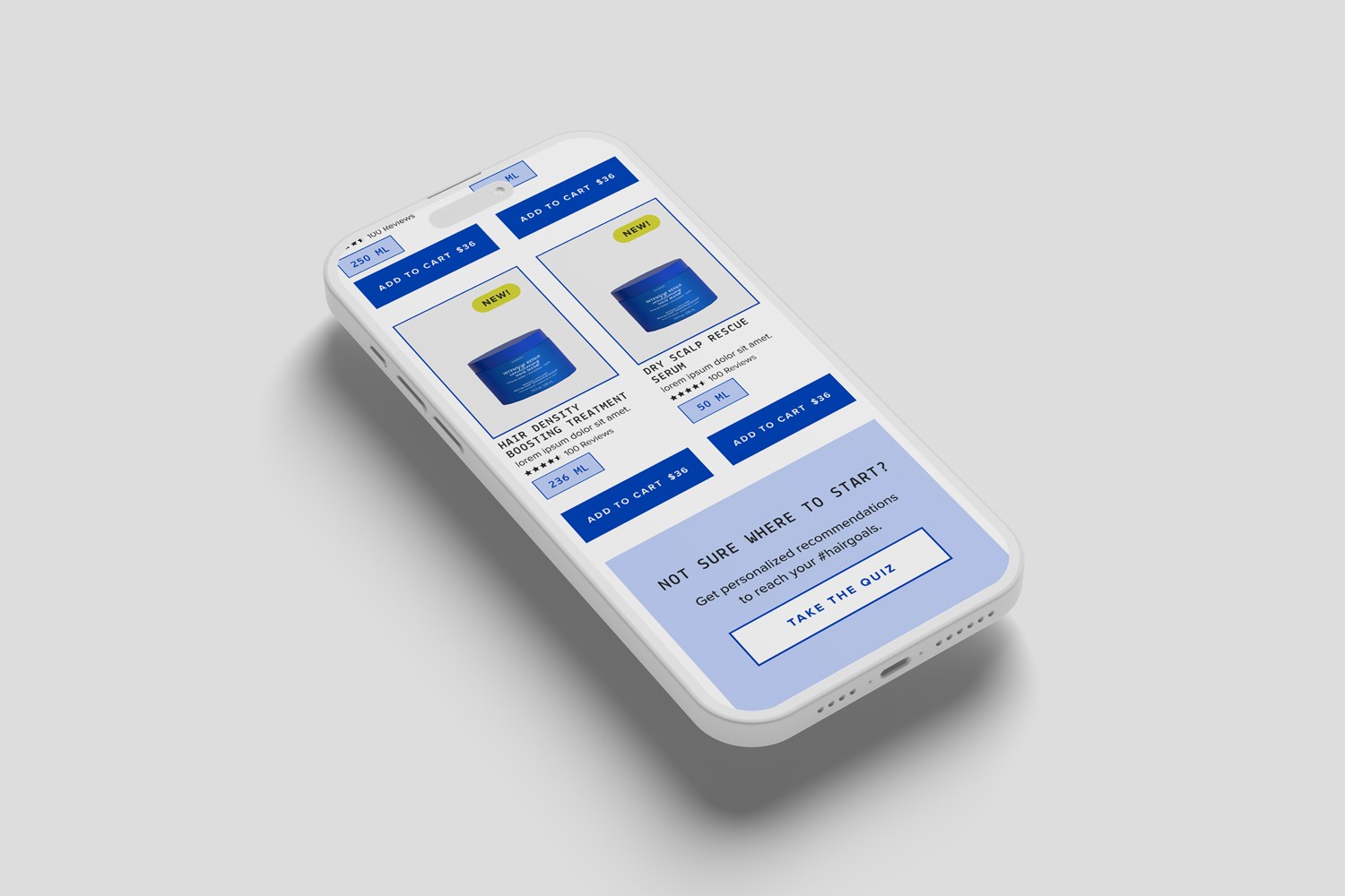
I structured the card so:

  • product name and image dominate visual focus,

  • secondary information follows in a clean, predictable order,

  • the Add to Cart button always appears in the same position.

This made comparison effortless and drove clearer purchase behavior.

Challenge:

Challenge:

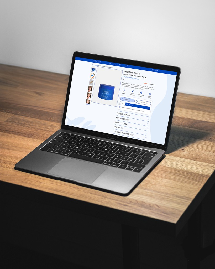
PDPs needed to show benefits, ingredients, claims, FAQs, and clinical results without overwhelming users

Solution:

Solution:

Progressive Disclosure :
Show the most important information first and reveal details gradually.

I created a layered structure:

  • a concise benefit overview at the top,

  • icon-based value props,

  • collapsible accordion sections for deep content,

  • clinical results positioned after product understanding.

This helped users navigate information logically and confidently.

Challenge:

Challenge:

Integrating social proof without breaking the layout

Solution:

Solution:

Distinct elements must stand out without disrupting flow.

I positioned social-proof blocks within generous whitespace and consistent card frames.
This made them stand out naturally while keeping the overall experience visually balanced.

Challenge:

Challenge:

Creating a modular, scalable system for future growth

Solution:

Solution:

Users expect your interface to behave like others they already know.

I created a modular system with:

  • familiar card patterns

  • predictable spacing

  • consistent typography

  • reusable section templates

This ensured new pages feel instantly understandable and maintain brand consistency.

Expected Outcome

Expected Outcome

Expected Outcome

Faster product discovery due to clean navigation and scannable categories

Faster product discovery due to clean navigation and scannable categories

Higher product understanding through structured PDP content and visual hierarchy

Higher product understanding through structured PDP content and visual hierarchy

Improved add-to-cart intent via optimized mobile cart drawer and sticky CTAs

Improved add-to-cart intent via optimized mobile cart drawer and sticky CTAs

Better engagement from quiz prompts and educational ingredient sections

Better engagement from quiz prompts and educational ingredient sections

Consistent user experience thanks to reusable components and predictable layouts

Consistent user experience thanks to reusable components and predictable layouts

Thanks for scrolling along

Thanks for scrolling along

Appreciate you taking the time to explore this project. I hope it offered useful insight into my UX process and how I design for clarity, scale, and real user needs.

Create a free website with Framer, the website builder loved by startups, designers and agencies.